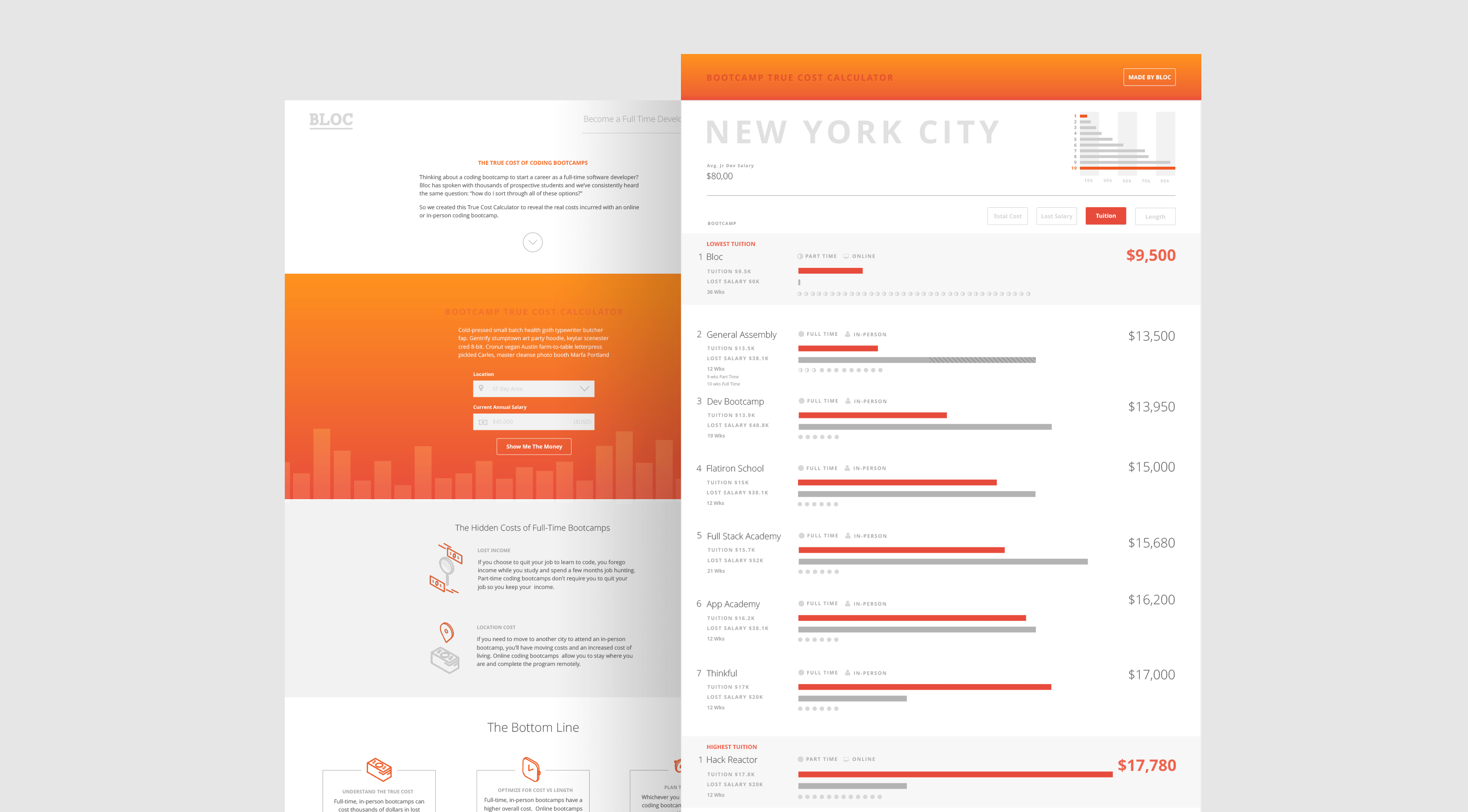
Bootcamp True Cost Calculator
We Built a Coding Bootcamp Calculator To Help Prospective Students
Coding bootcamps are immersive educational programs that focus on software development. While the premise of a coding bootcamp is simple - enroll, learn, launch a career - selecting the right bootcamp is not. Prospective students have many constraints to consider, the most restrictive of which are program length and cost. We've spoken with thousands of prospective students and understand these constraints. These constraints became the foundation for the calculator.
Program Length
Most full-time programs promise to turn a new student into a junior developer in 12-18 weeks. Part-time programs make the same promise, but offer a longer, and sometimes more flexible schedule.
Cost
The price of the bootcamp is the most obvious cost to consider, though depending on the coding bootcamp, a student may incur a loss of income while enrolled. This can add tens of thousands of dollars to the overall cost of the program.
The Challenge
Create a resource to help students compare bootcamps in top tech cities based on program length and cost. Optimize the bootcamp search with personal data, such as user's location and salry to help prospective students find the best bootcamp for them. This tool needed to be fully responsive and embeddable.
1/8
Gathering the data
Geographic Focus
We gathered data from the top tech cities where coding bootcamps are located: Atlanta, Austin, Boston, Chicago, Denver, Los Angeles, New York City, Seattle and San Francisco Bay Area.
User Intent
We decided to only include career-oriented bootcamps in the calculator results to increase signal and reduce noise. We were diligent in our research of bootcamps to ensure that we represented them fairly.
Data Normalization and Assumptions
After assessing program length and cost data for each bootcamp, we discovered that the data needed to be normalized:
- Pre work, part time, and full time features required consistent definitions, as they all contribute to the length of the program.
- Tuition was variable based on program length and the fact that some bootcamps take a percentage of salary when a student gets hired.
- The average salary of a junior developer was pulled from job listings on Indeed.com
We did not include certain factors that could influence overall cost, namely relocation and financing options. We felt they would be relatively minor and too difficult to normalize.
2/8
Design Requirements
Our primary requirement was that the calculator be embeddable, allowing the final product to be shared in articles and blogs discussing the cost of coding bootcamps. An embeddable calculator needed a fully responsive layout. We asked ourselves: How might we create an online calculator that is visually interesting and easy to understand, but responsive at any size? Our design strategy followed these two guiding design principles:
The representation must be visually interesting and easy to understand:
- Use a harmonious, but energetic color palette
- Leverage familiar, cross-cultural design patterns
- Emphasize legibility to limit data density
2. The output must be adaptable to any size:
- Only use mobile friendly interactions
- Design for a fluid, percentage-based layout
3/8
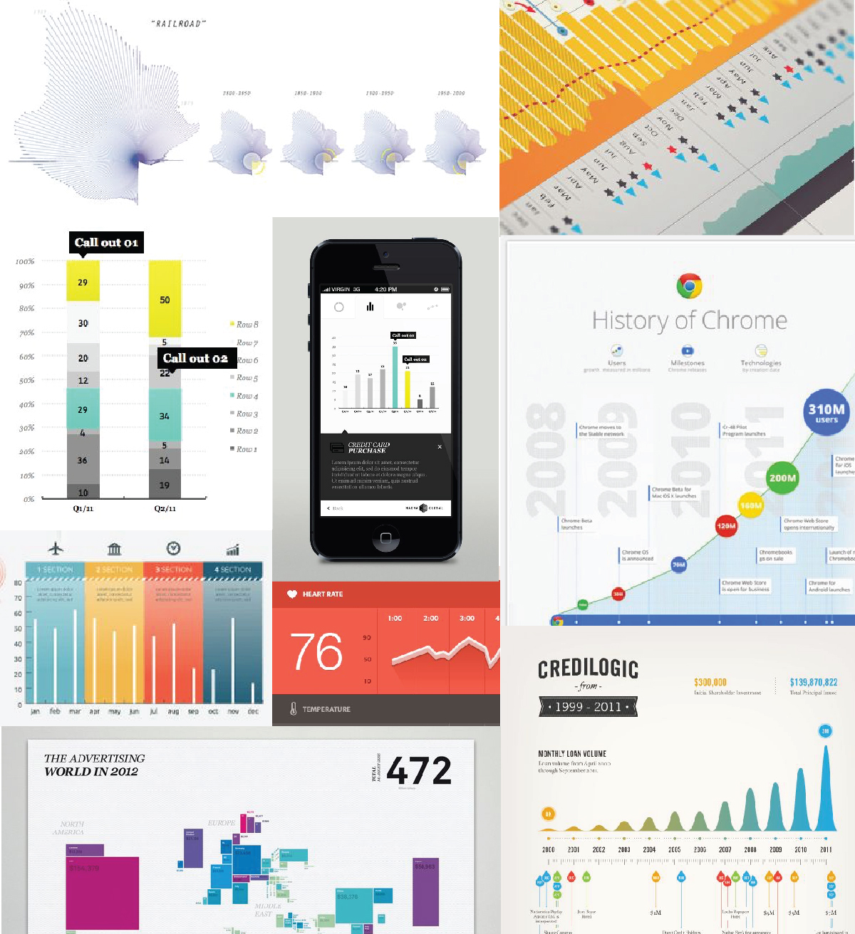
Moodboarding
Moodboarding is a great way to establish the feel of a project, to collect inspiration, and establish your own interpretation. We used moodboards to focus on visually compelling and functional data visualizations.
4/8
Sync with engineering
Met with the engineers to discuss how the purposed functionality lined up with how data is organized on the backend. There were some structural issues that would determine design choices. On the backend, there are two ways that data is classified: by user and by enrollment. Considering this, I started thinking about how account pages should function for repeat students. Toggling between courses wasn’t going to work because notes were tied to a user, not an enrollment. So, I had an answer for my course dropdown idea - it wouldn't work!
5/8
Iterate and Test
After the engineering sync I had a much clearer idea about the data structures of these pages. From there I continued to iterate and test concepts with the users. I went through a lot of variants. Feel free to shoot me a message to see some of the crazy things I tried.
Things I learned
- While it may make more sense visually, separating the account events from notes isn't a great experience for users. It is more helpful for them to see a chronological account history.
- While digging into the need for edit, delete, and save functionality, I realized what we really needed was better permissions. Users felt uncomfortable publishing notes with private student details or complaints where everyone could see them. It also brought up the question of who can edit and delete notes. Any admin? Just the author? It was an important issue, and we decided permissions would be its own project in the near future.
- Something as simple as a table can be very important to some users. I was playing around with changing the layout of the enrollment chain data, but engineering requested it be structured similarly to how it is laid out in the data base, and kept in a table. So I updated the table styles instead of making a drastic change.
6/8
Final Concept
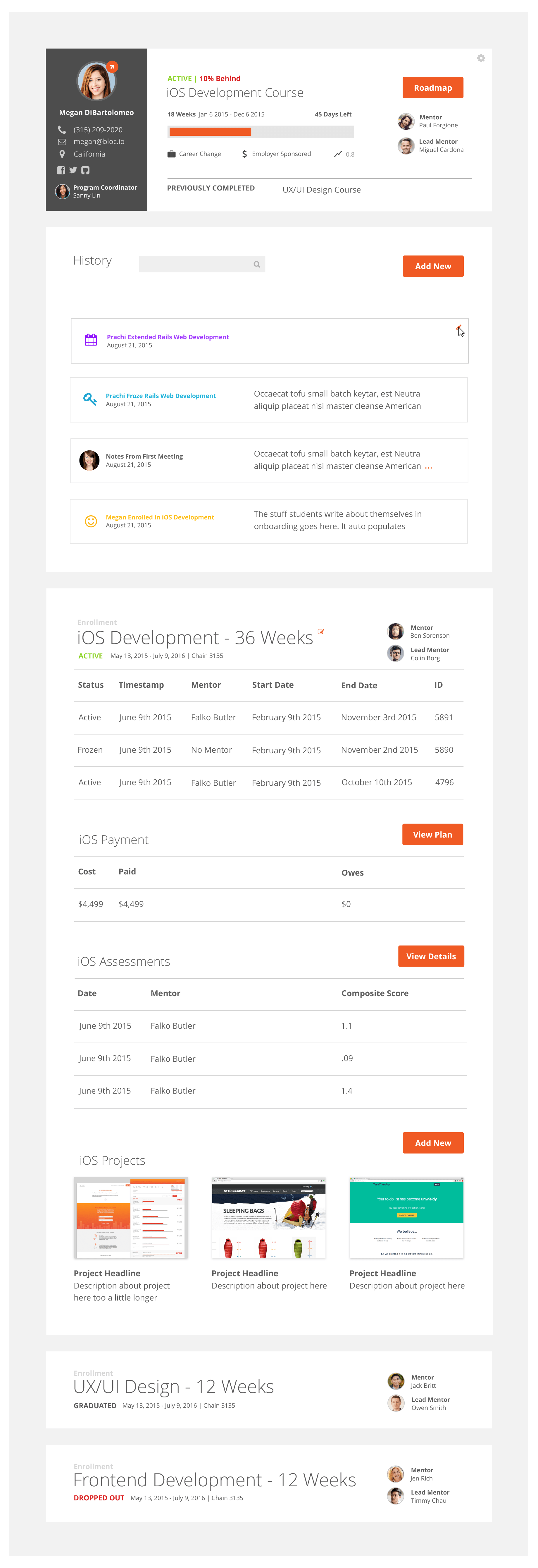
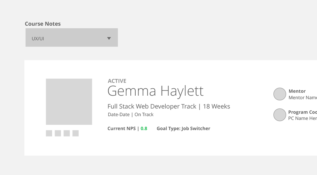
Student Summary
Pulled out the Morph action from the crowded dropdown under the gear icon. Removed some friction for this high frequency action.
Easily understand a student's progress through the curriculum.
Added a progress bar and a label of remaining days to quickly assess how long a student has been in their program.
Easily navigate to a student's roadmap
View the student's Mentor and Lead Mentor.
View previously completed courses. Click on these and the page will scroll to the corresponding enrollment table at the bottom.
See the student's goals, NPS, and payment source.
View the student's contact information and Program Coordinator.
Account History
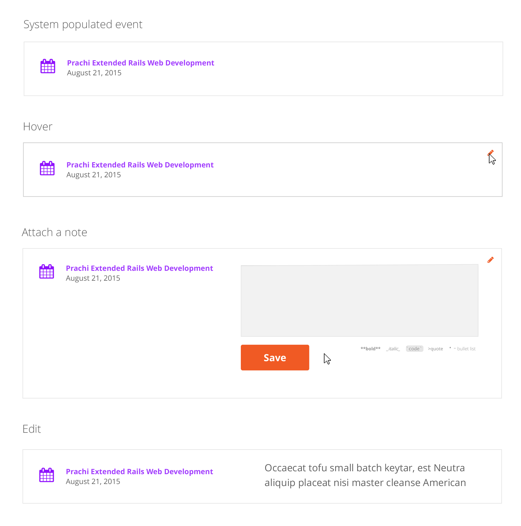
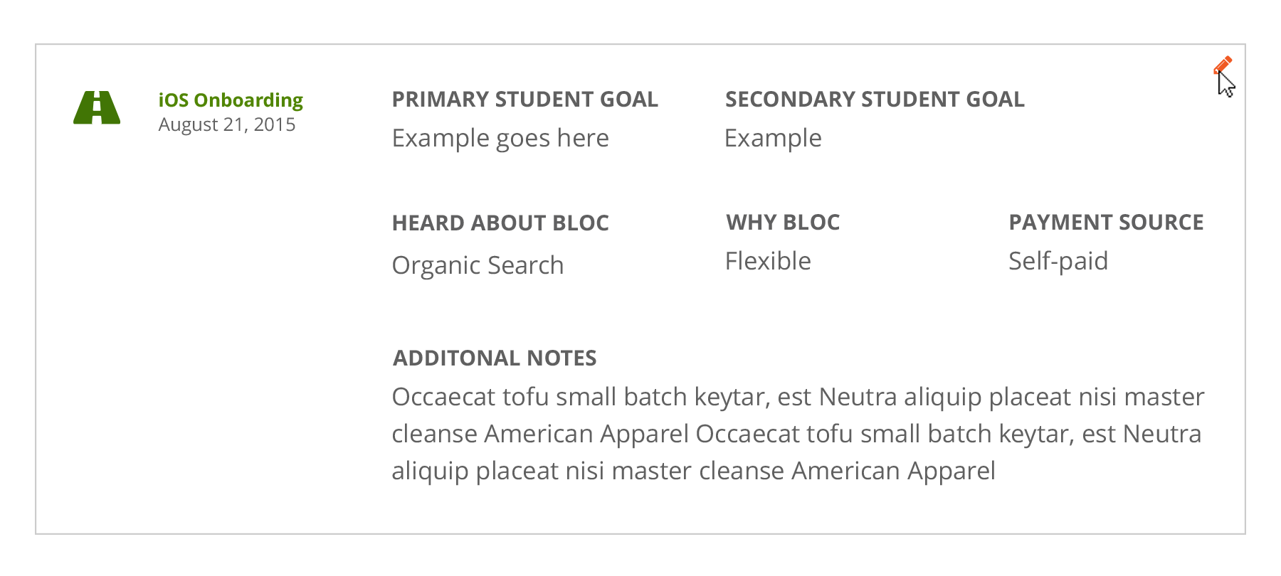
A unified account history section contains free-form notes, structured notes, and account events in chronological order.
Search the account history section.
Automatic account events populate with an assigned icon and color. Hover over the event and an edit icon appears. To save space and give context to events, users can now add notes directly to an event, rather than having two separate data pieces.
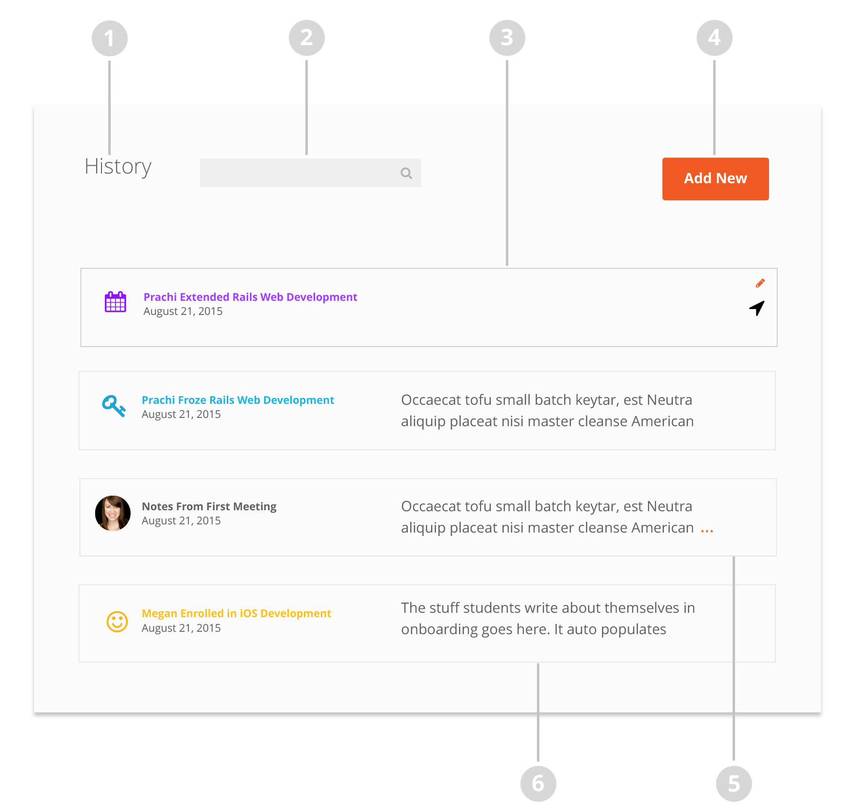
Add a new stuctured or free form note here.
Free form notes now have author photos and titles. Notes now automatically collapse past two lines. Orange ellipses alert the user that there is more content to view. Users can click anywhere to expand.
Student autobiographies, which before were taking up space at the top of the page, are now auto-populated in the enrollment event.
Adding new notes
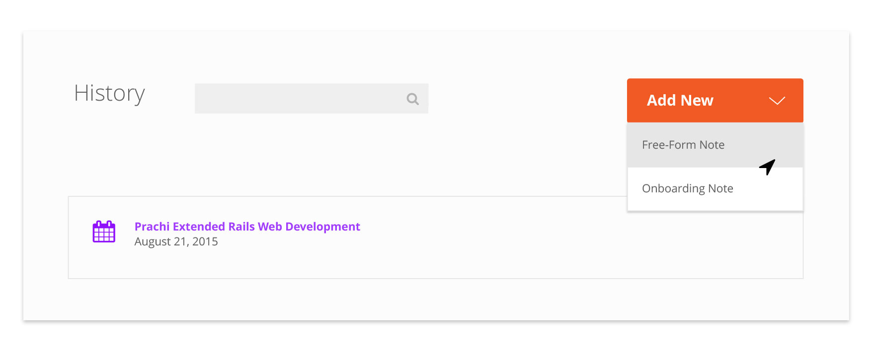
Free-Form Notes
While still simple, free-form notes now have headlines and markup hints for users. Coupled with the ability to edit and delete after publication, student notes are a much more valuable tool than before. These improvements will encourage greater use and allow Bloc to understand their students better than ever before
Editing Free-Form Notes

Structured Notes
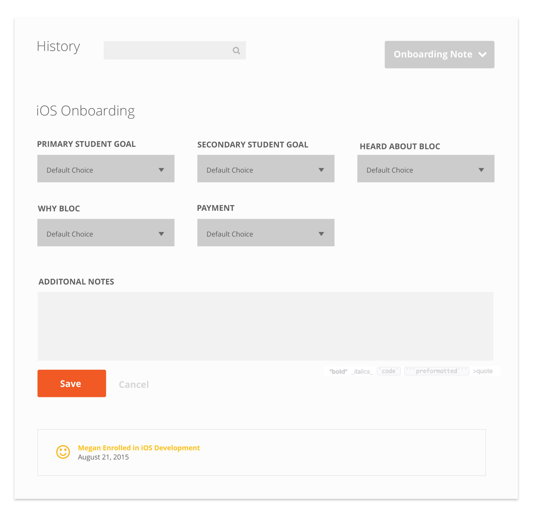
Above is an example of a structured onboarding note. Users fill out the multiple choice forms and also have an area for free form details.
Published structured notes can be edited, but not deleted.
Attach a note to an account event