

Bloc Student Account Pages
Bloc admins use account pages to store notes about students, make account changes, and to view individual student data. When I began this project, the account pages were some of the oldest, most data-rich pages on our platform. Despite the importance of these pages, they had very little functionality. They were still very much in the "most viable product" phase. Most importantly, we were not able to track and classify student data in the aggregate.
Original Challenge
Add a way to input and track structured student data on top of the existing student account pages. Design time was spec’d as 3 days. It was to be a short, patch project.
As soon as I started to dig in, I realized that there was some very low hanging fruit that we needed to address on these pages.
Before
- Two of the most high traffic actions on this page are navigating to a student’s Roadmap (where they submit assignments) and Morphing into a student. Morphing allows you to view the platform as a different user. Both of these actions were buried with other obscure actions in a dropdown.
- Basic but important student info was at the very bottom of the page. Student biographies took excess space at the top of the page, serving very little purpose outside of onboarding.
There was very minimal input UI for notes. There was only a scalable gray box which had no saving, formatting or editing capabilities. Published notes could not be deleted.
Notes became an info dump with no way to organize or search. They didn’t even have titles.
On the page was an account history section that logged account events and notes. Many times making an account change, such as freezing an enrollment, would also require notes to explain the action. Published notes were not always near the event in the layout. The context for an event could be lost because proximity was not consistent.
Most of the styles on the page were out of date with our current UI patterns.
I knew that the power users of these pages were Program Coordinators. At Bloc, a Program Coordinator acts somewhat like a guidance counselor, supporting and keeping their students on track. Each PC can have hundreds of students at a time, so efficiency is very important. Eliminating these pain points would be huge improvements for Program Coordinators, and would allow them to spend more time attending to the needs of students.
My analysis led me to pitch a much broader overhaul. After selling stakeholders on the value and importance of expanding the project, I took a step back to approach the process holistically. I was given about two weeks to research, wireframe, and iterate. I was the sole designer responsible for the project.
Revised Challenge
Research high leverage improvements for the Student Account pages in addition to the original need for structured student notes.
1/8
Research
Understand the needs of the stakeholders
Identify primary and secondary users
User Interviews
Findings
This page is a hub for all student info. It should be able to support robust data, and this data should be easy to evaluate.
Users come to this page:
- When making a change to the account (drop-outs, pace changes, freezes, mentor changes, payment plan adjustments, etc.) These changes often require adding a note for context.
- When they need to remind themselves of the details of a student.
To navigate to the student’s roadmap, morph into the student, or get student contact info.
To log notes about the student.
2/8
Determine Needs
Support deep data dives and quick visits.
Consolidate and save space.
Make the account history section, which contains account events and notes, more organized
Add edit, save, and delete functionality to notes
Create structured notes
Improve page hierarchy
Update UI elements and styles
3/8
Wireframe
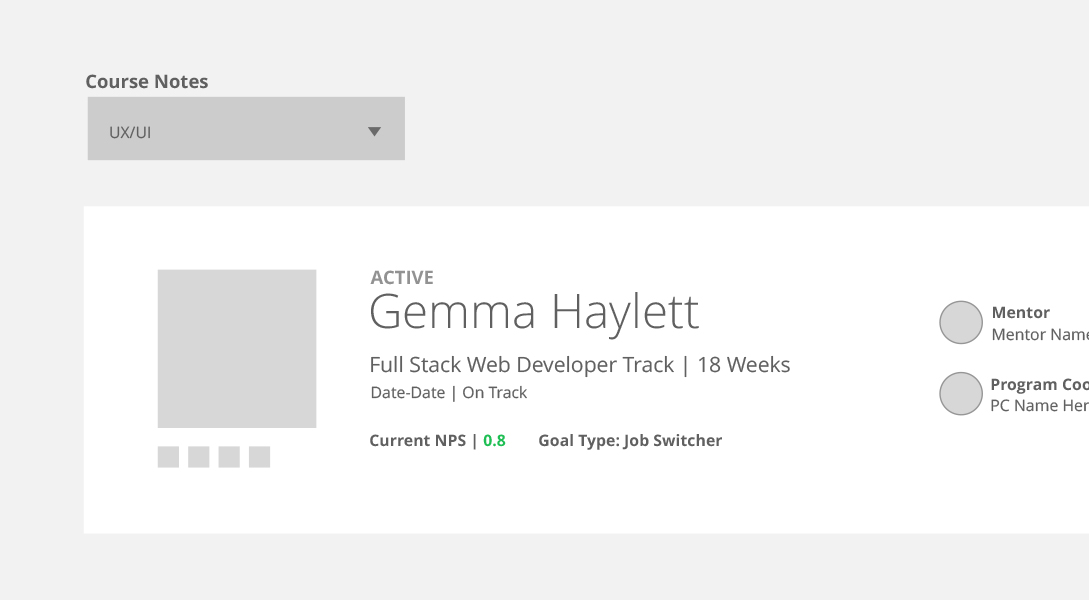
Student Summary
- Top of the page for quick assessment
- Contains important student details
This will be helpful for quick reminder visits. There were many iterations here, send me a message to see more.
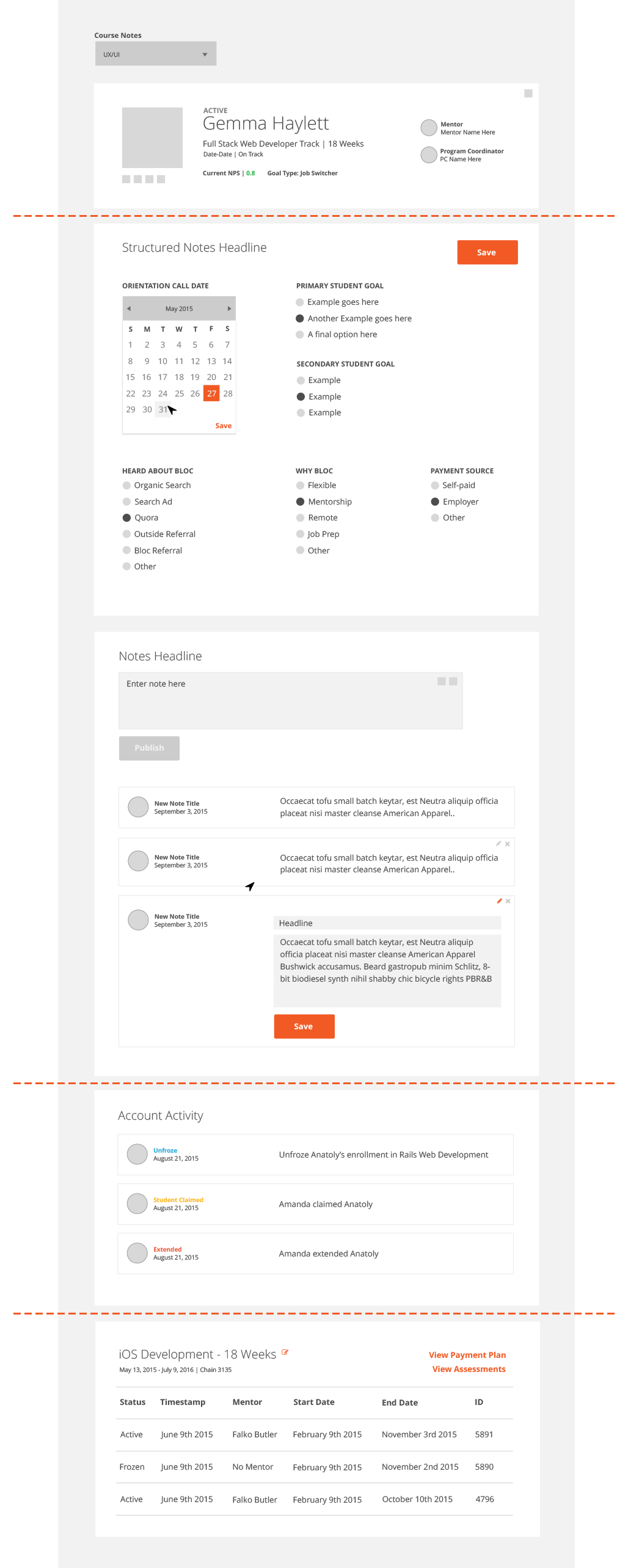
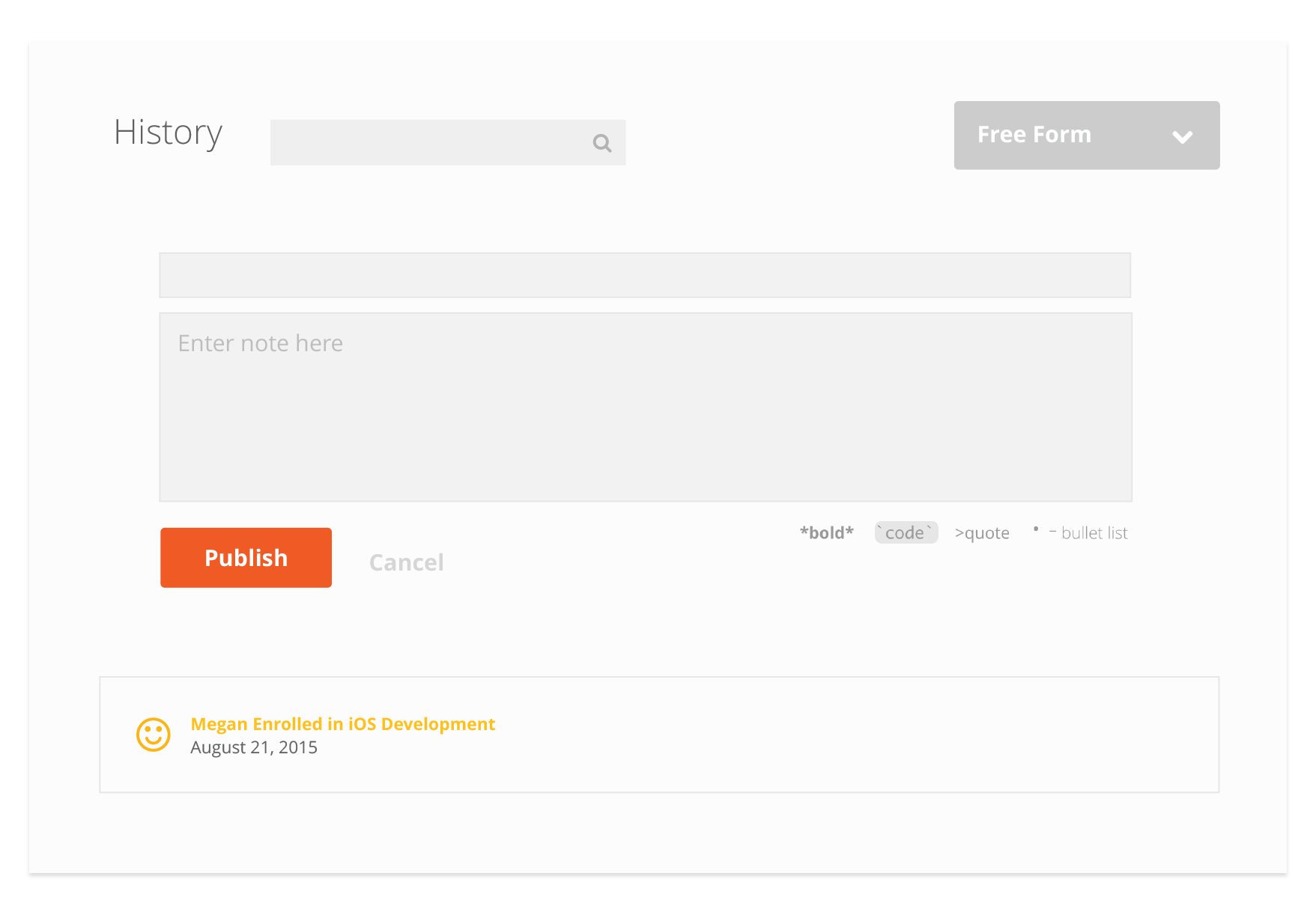
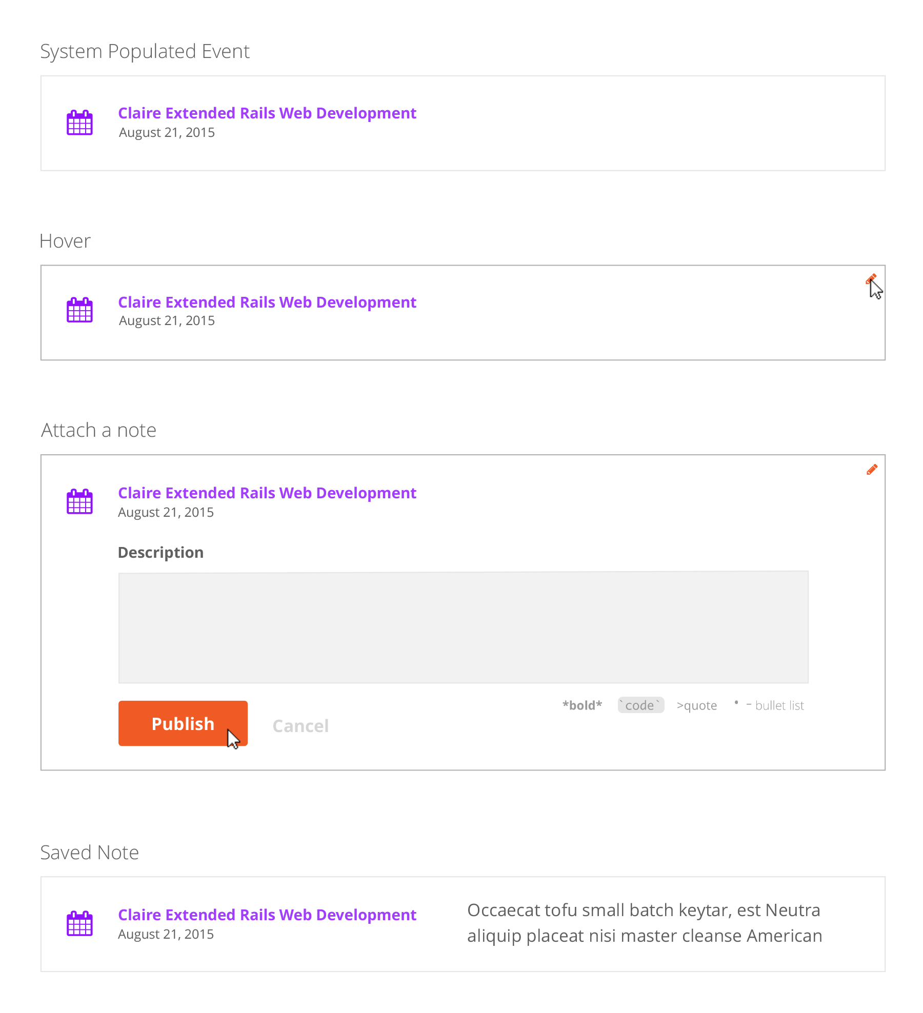
Notes
At this stage, structured notes and freeform notes were separate. In this view, the structured onboarding note, which is filled out during a student's orientation call, was expanded. We have created set answers to onboarding questions so we can begin to see patterns in the aggregate.
In the freeform notes section, the input is still simple. The two squares in the upper right of the form indicate where simple formatting tools could go. In this view, the flow for editing and deleting a published note is shown.
Freeform notes have been improved in simple ways. Published notes have titles and author photos to increase legibility, and make it easier to find specific notes
Account Activity
At this stage, account activity is separated from notes to make it easier to see events all in one place. The account events now have color-coding and a space for an assigned icon.
Enrollment Chain Data
This section contains the specific data of an enrollment. Engineers requested that it be kept in a table format, to reflect how the data is structured on the backend. The table also contains links to make account changes, view student assessments, and edit the student's payment plan.
Early challenges
Some Bloc students enroll in multiple programs. In the wireframes I struggled to find a way to separate the data on the page by enrollment. I landed on using a drop down to toggle between enrollments and update the page. This way, users would be able to filter information by program.
4/8
Sync with engineering
Met with the engineers to discuss how the purposed functionality lined up with how data is organized on the backend. There were some structural issues that would determine design choices. On the backend, there are two ways that data is classified: by user and by enrollment. Considering this, I started thinking about how account pages should function for repeat students. Toggling between courses wasn’t going to work because notes were tied to a user, not an enrollment. So, I had an answer for my course dropdown idea - it wouldn't work!
5/8
Iterate and Test
After the engineering sync I had a much clearer idea about the data structures of these pages. From there I continued to iterate and test concepts with the users. I went through a lot of variants. Feel free to shoot me a message to see some of the crazy things I tried.
Things I learned
- While it may make more sense visually, separating the account events from notes isn't a great experience for users. It is more helpful for them to see a chronological account history.
- While digging into the need for edit, delete, and save functionality, I realized what we really needed was better permissions. Users felt uncomfortable publishing notes with private student details or complaints where everyone could see them. It also brought up the question of who can edit and delete notes. Any admin? Just the author? It was an important issue, and we decided permissions would be its own project in the near future.
- Something as simple as a table can be very important to some users. I was playing around with changing the layout of the enrollment chain data, but engineering requested it be structured similarly to how it is laid out in the data base, and kept in a table. So I updated the table styles instead of making a drastic change.
6/8
Final Concept
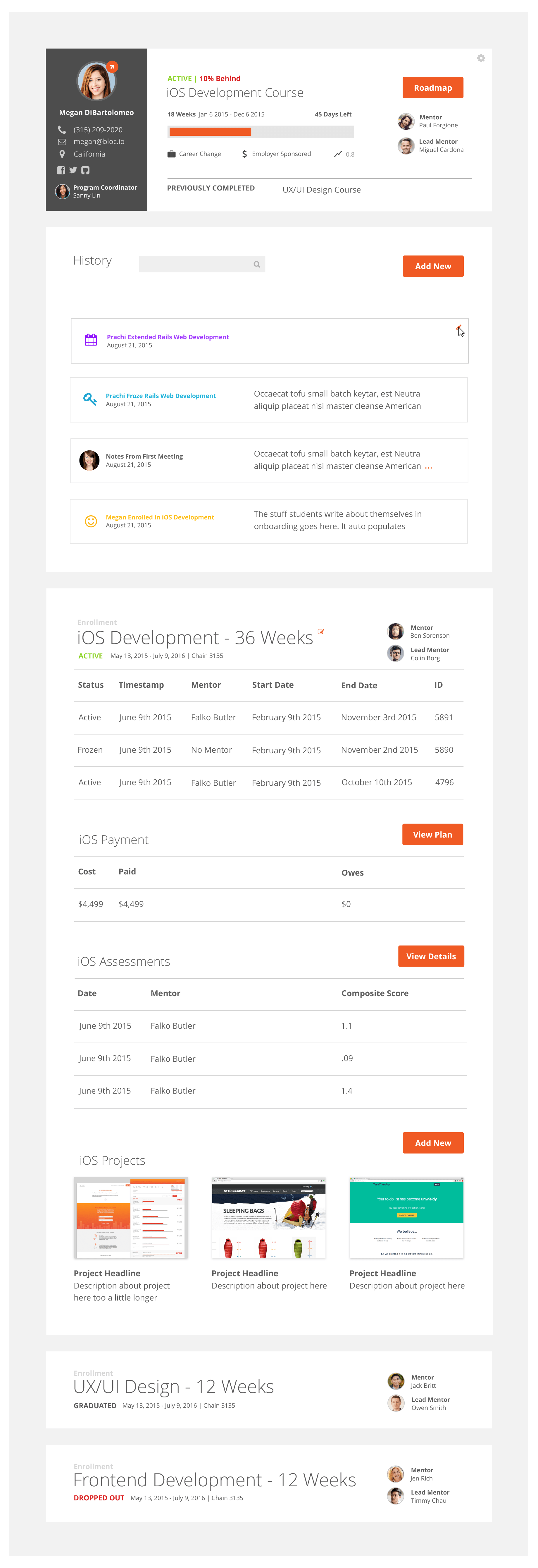
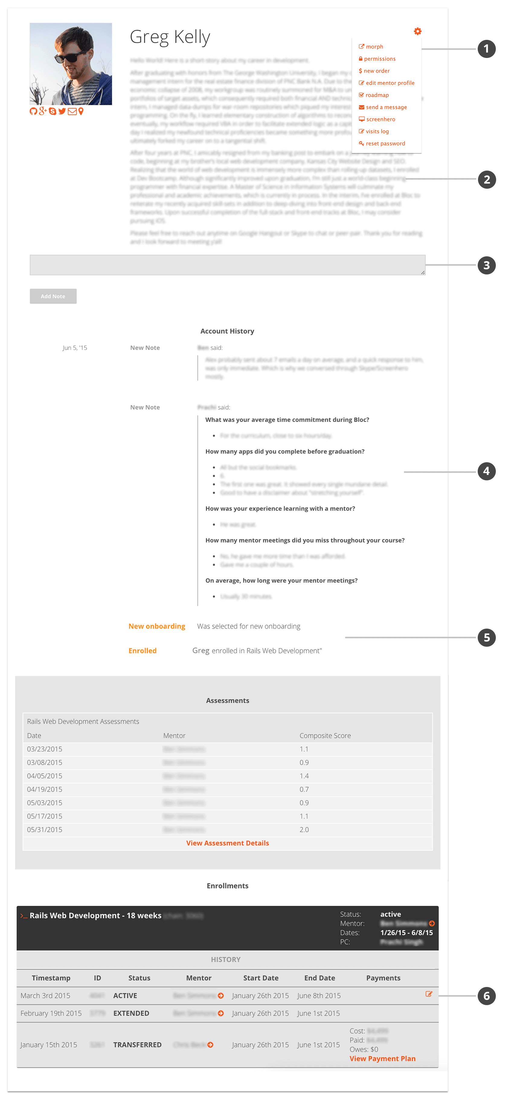
Student Summary
Pulled out the Morph action from the crowded dropdown under the gear icon. Removed some friction for this high frequency action.
Easily understand a student's progress through the curriculum.
Added a progress bar and a label of remaining days to quickly assess how long a student has been in their program.
Easily navigate to a student's roadmap
View the student's Mentor and Lead Mentor.
View previously completed courses. Click on these and the page will scroll to the corresponding enrollment table at the bottom.
See the student's goals, NPS, and payment source.
View the student's contact information and Program Coordinator.
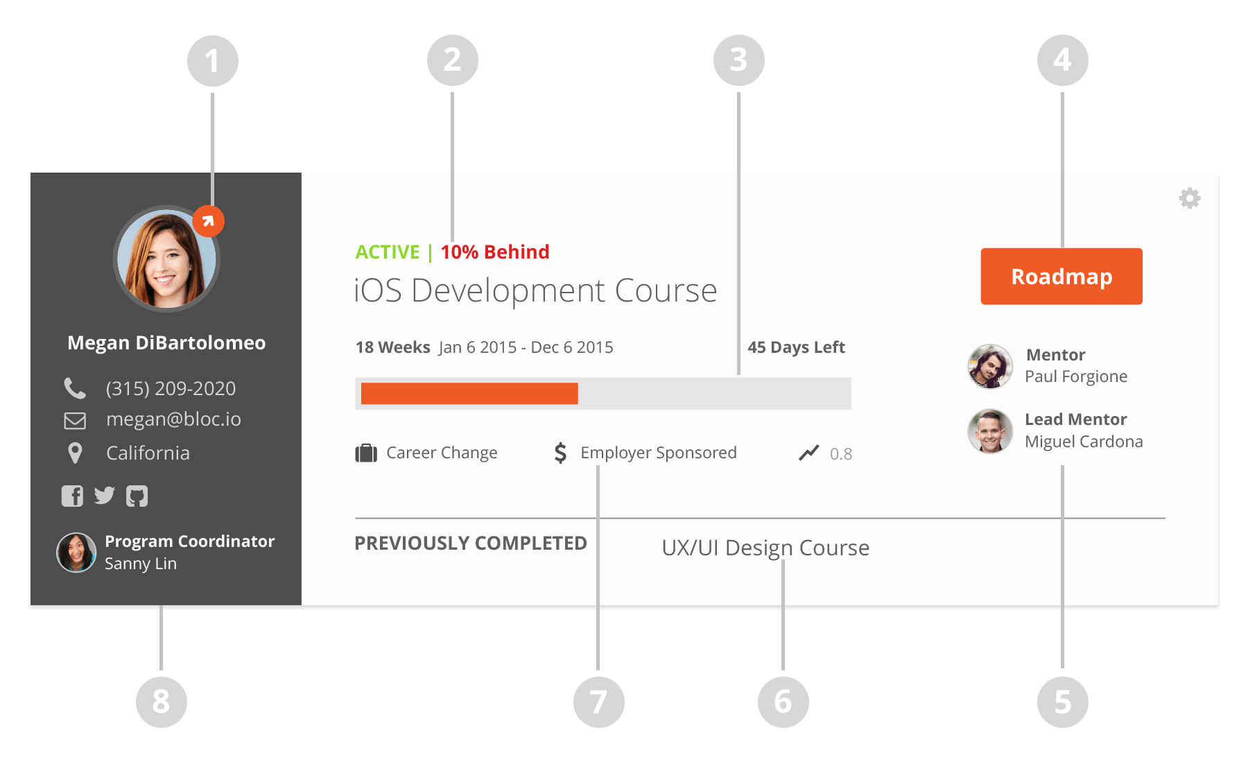
Account History
A unified account history section contains free-form notes, structured notes, and account events in chronological order.
Search the account history section.
Automatic account events populate with an assigned icon and color. Hover over the event and an edit icon appears. To save space and give context to events, users can now add notes directly to an event, rather than having two separate data pieces.
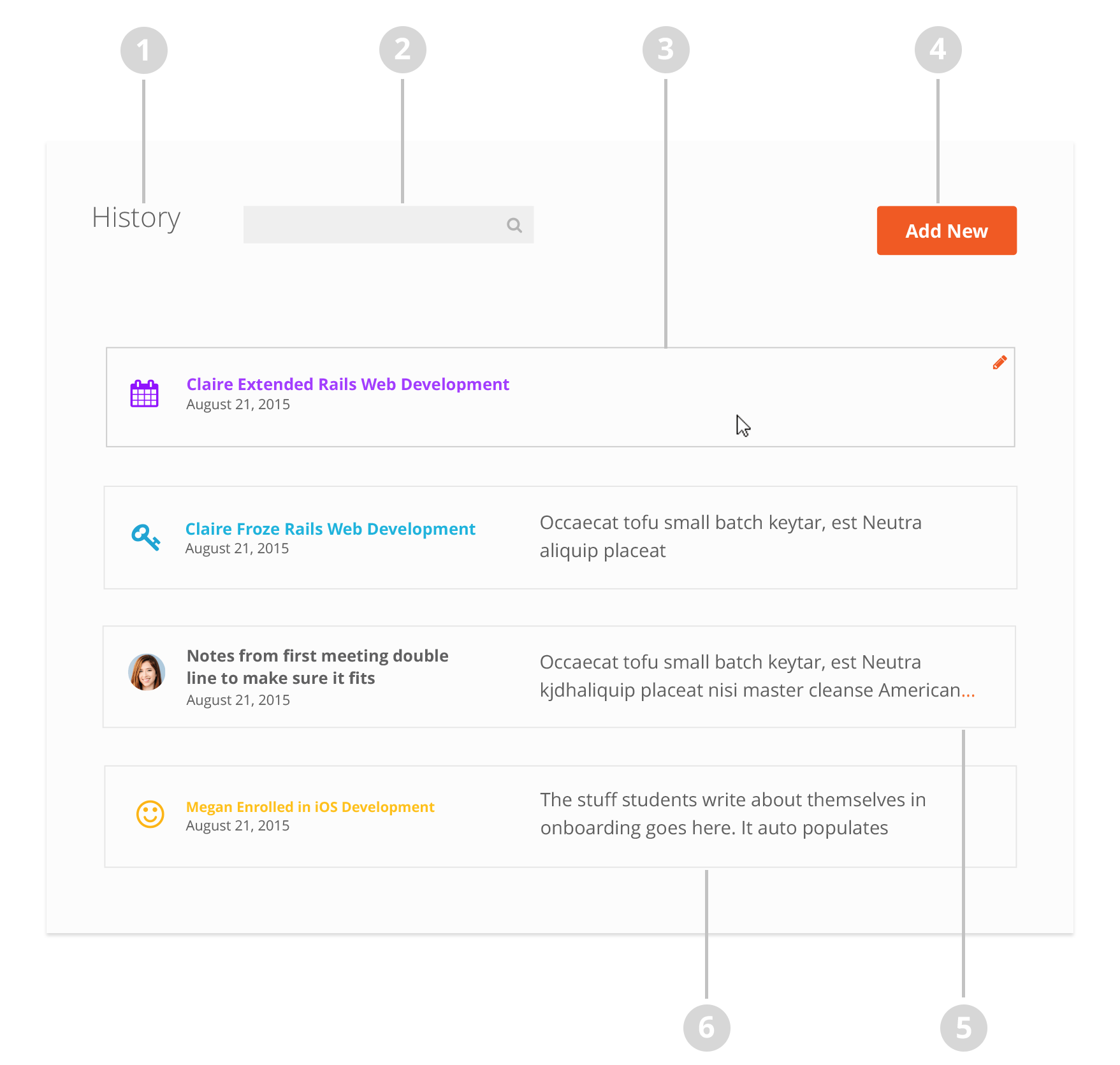
Add a new stuctured or free form note here.
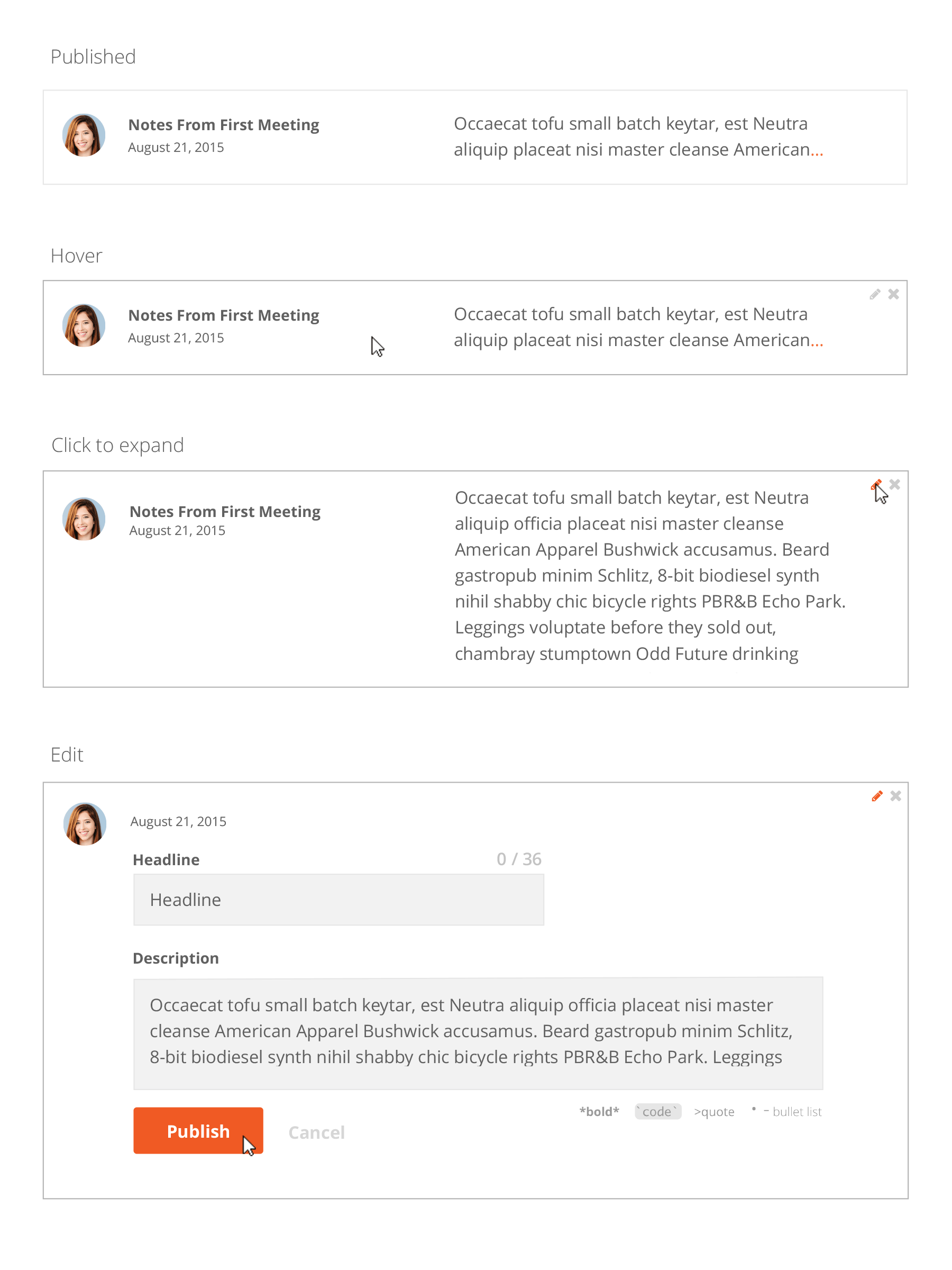
Free form notes now have author photos and titles. Notes now automatically collapse past two lines. Orange ellipses alert the user that there is more content to view. Users can click anywhere to expand.
Student autobiographies, which before were taking up space at the top of the page, are now auto-populated in the enrollment event.
Adding new notes
Free-Form Notes
While still simple, free-form notes now have headlines and markup hints for users. Coupled with the ability to edit and delete after publication, student notes are a much more valuable tool than before. These improvements will encourage greater use and allow Bloc to understand their students better than ever before
Editing Free-Form Notes
Structured Notes
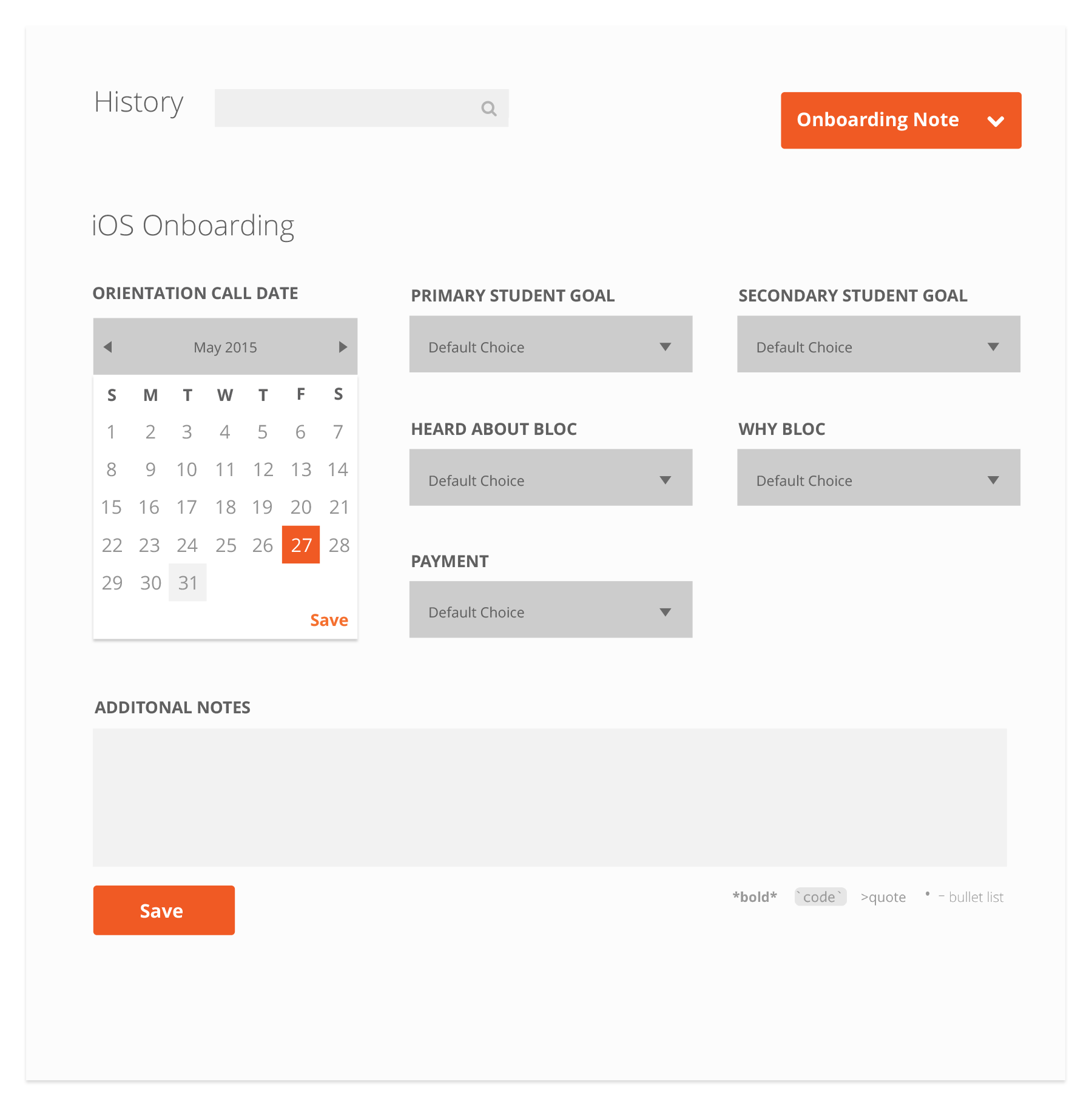
Above is an example of a structured onboarding note. Users fill out the multiple choice forms and also have an area for free form details.
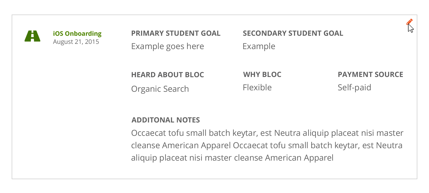
Published structured notes can be edited, but not deleted.
Attach a note to an account event
Enrollment data tables
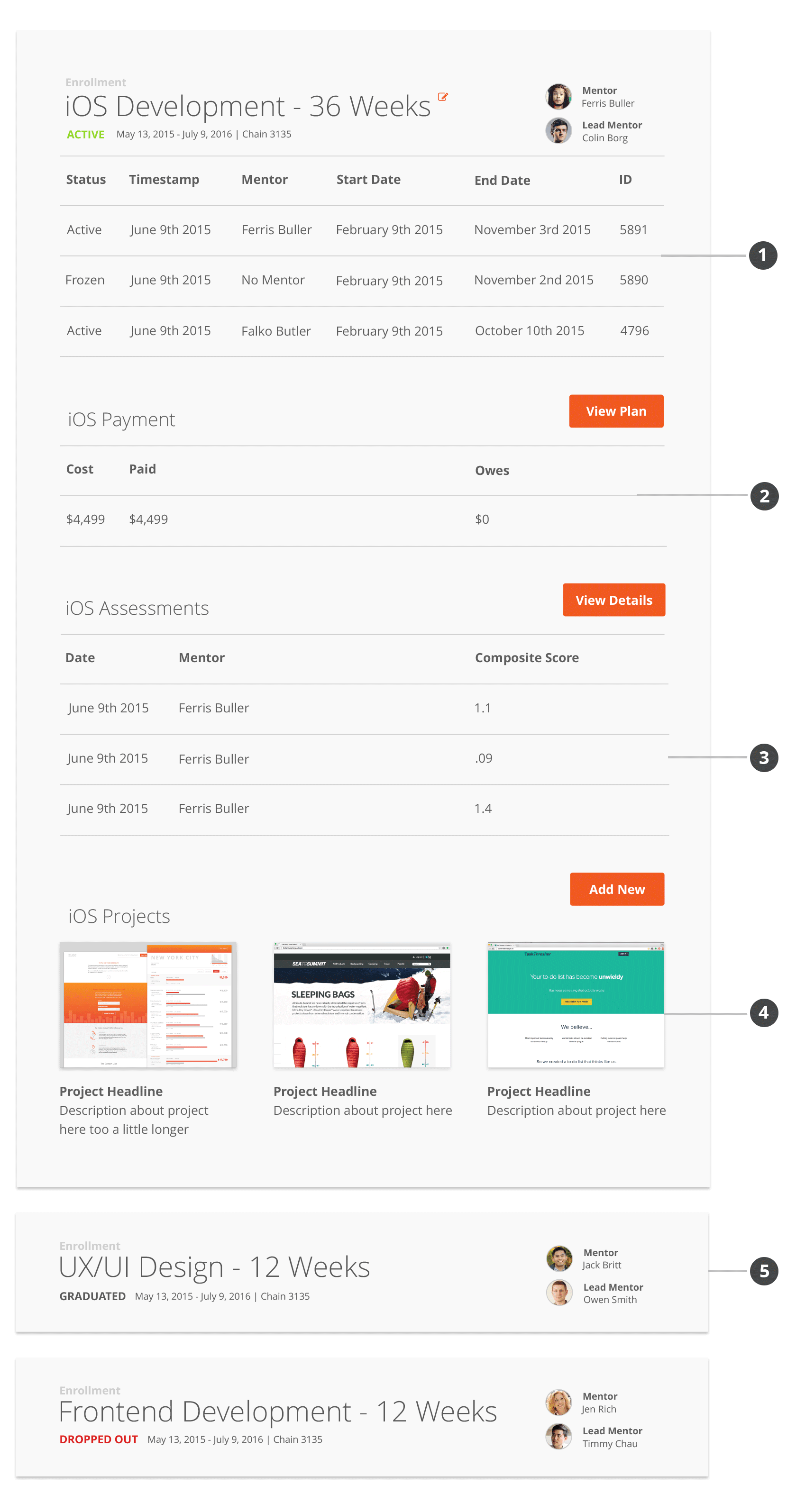
- I updated the styles of the original table, while also adding adding addtional information and improving the information hierarchy.
- Payment plan data has been broken out into its own table. A button provides quick access to view the plan in full.
The assessments table has updated styles and has been encorporated into the enrollment section. A button provides quick access to view the assessments in full.
Project screenshots and links can now be logged on the account page. This makes it much easier to keep track of student work and achievements.
Multiple enrollments collpase and stack by default, and can be expanded on click.
7/8
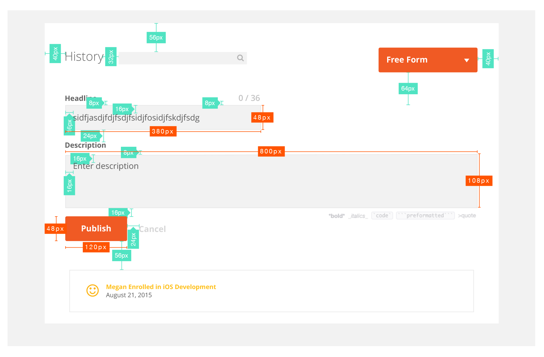
Specs for development
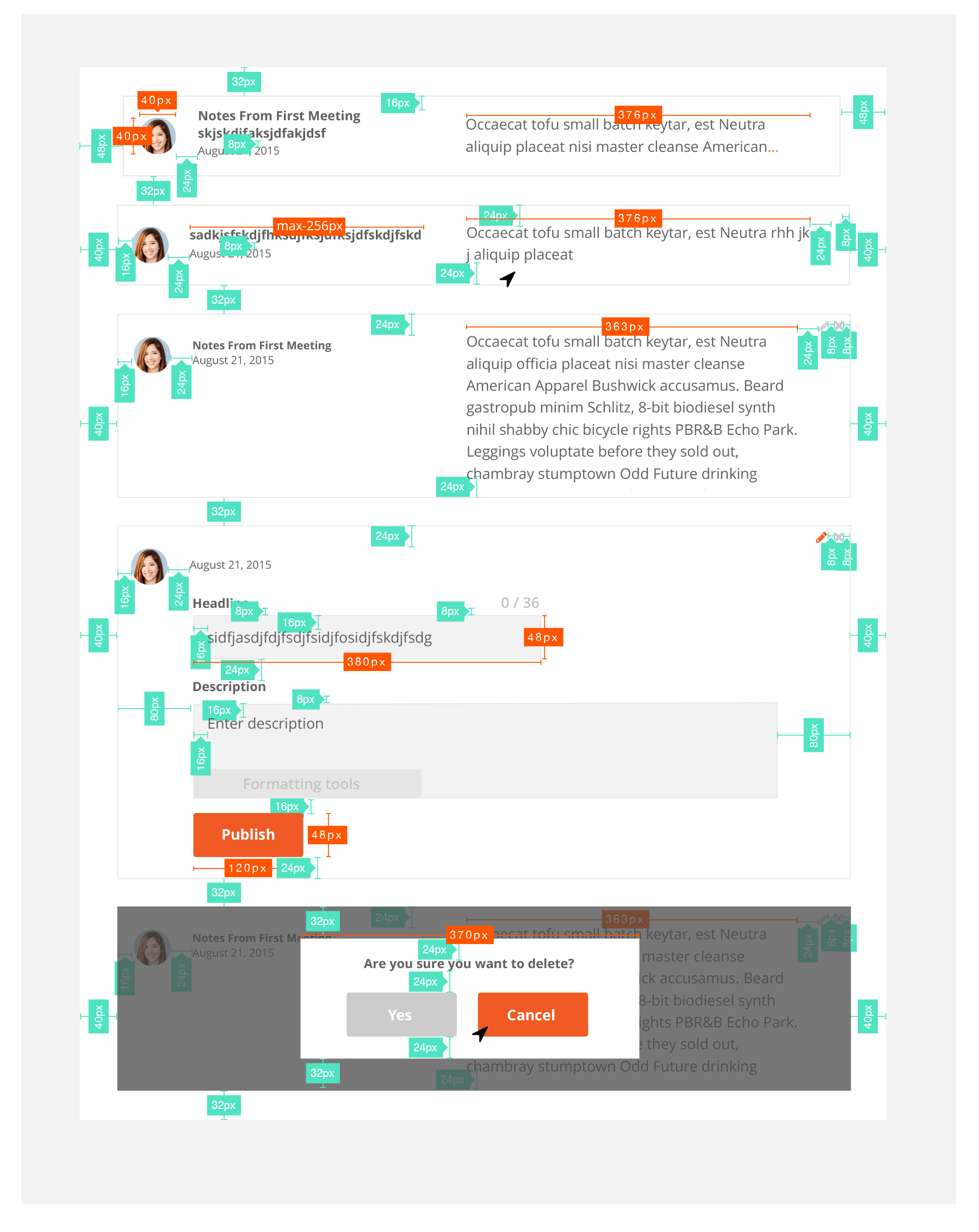
The project was broken into phases for development. We decided the updated Account history section would be phase I, because it contained structured notes which were the most pressing need. I used Sketch Measure to redline the designs, and put together a deck as a resource for the engineers. Below are some examples of the measured designs.
8/8
Final Thoughts
This wasn't the sexiest project
But, I learned a lot. This was one of the first projects at Bloc where I played all the roles: PM, researcher, UX, and visual design. I naturally wish I had done some things differently. Specifically:
- User testing with prototypes. I thought I didn’t have enough time, but they would have been really helpful. Now I know protoypes are something you make time for. Even if i had just thrown it into Invision, I would have gotten much more insight than gathering user feedback with static comps.
- More agile, less waterfall. During this project I was still trying to find my flow with engineering. Though I checked in with them about my designs multiple times, I still ended up just handing them polished specs. We didn't really do any work in tandem. Since then, I've have a better process in place with engineering. After deciding scope, functionality, and goals together, I deliver rough wireframes. Engineering builds a working prototype as I work through visual design. This way, if something about the functionality or UX won't work, I can adapt the design quickly.
Have questions or comments? Hit me up!